01 · the problem
A browsing interface fails exactly when it matters most. Someone who needs the nearest hospital right now should not be composing a search, reading reviews or deciding between three results, and someone in an emergency should not be leaving the app to dial. The metric that matters is not how much the map knows; it is how many decisions sit between opening the app and getting help.
02 · what i built
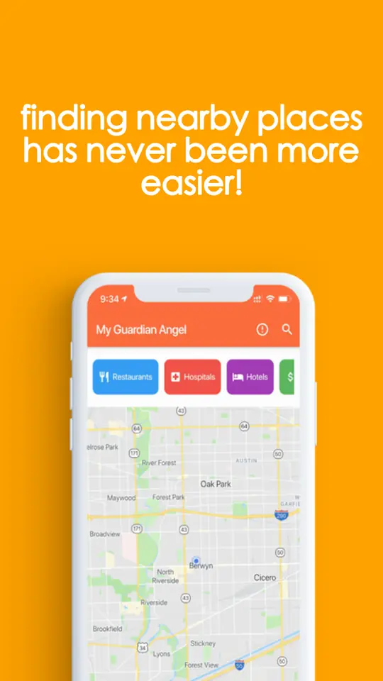
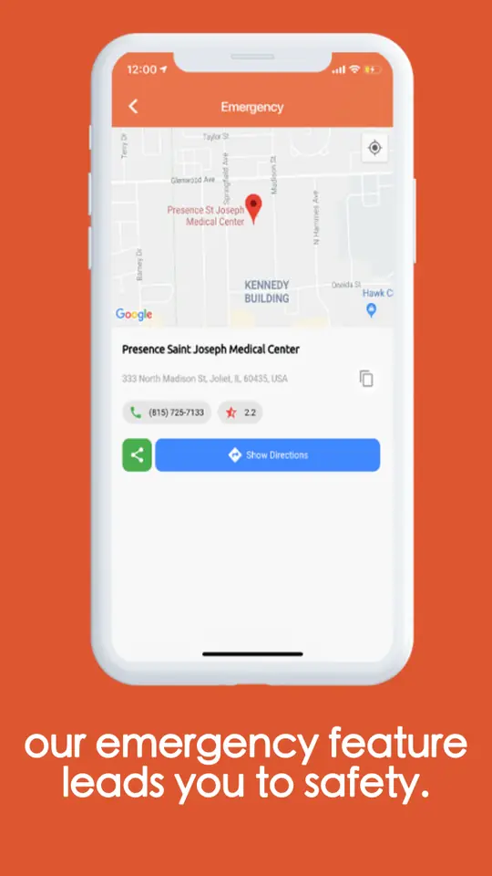
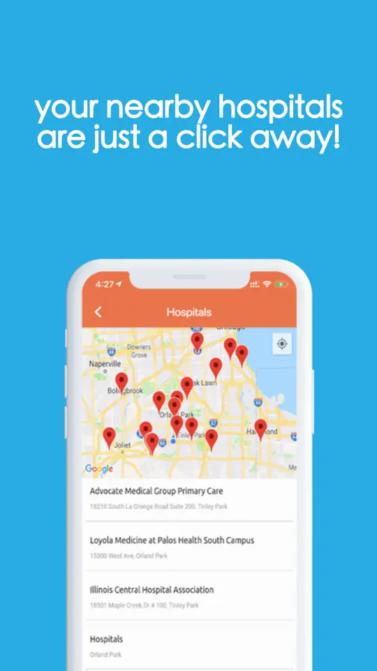
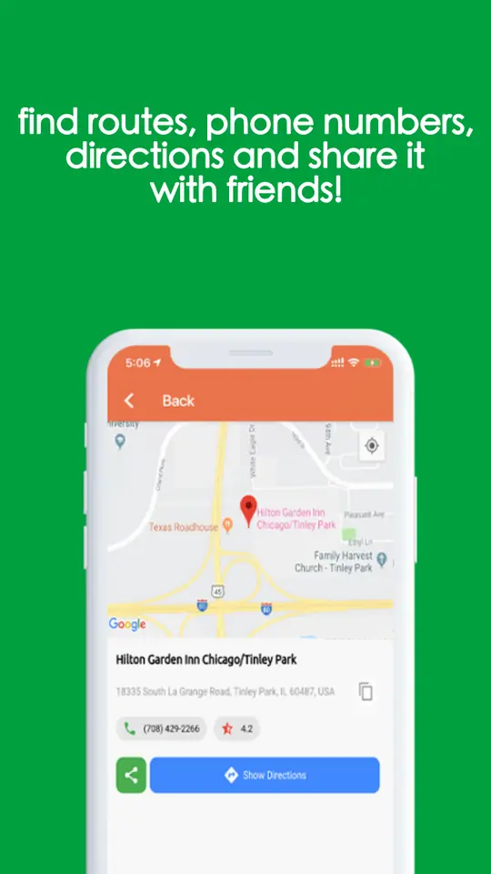
Categories instead of a search box. Hospitals, gas stations, hotels, bars, restaurants, shops and restrooms are each one tap, ordered by proximity, each result arriving with directions, a phone number and a rating already attached so there is no second lookup. On top of that sits a dedicated emergency path that routes straight to the nearest trauma care centre, which is the one journey the app refuses to make anybody navigate for. There is no login and no sign-up, and the app stored no user data, which is both a privacy position and one fewer screen between a person and the thing they need.
- One-tap categories
- Hospitals, gas stations, hotels, bars, restaurants, shopping and restrooms, each a single tap and each ordered by how close it is, rather than a query to be typed and refined.
- Emergency routing
- A dedicated path to the nearest trauma care centre. The one journey in the app that is never allowed to require a decision.
- Everything on the first result
- Directions, phone number and rating arrive with the place itself, so acting on a result does not mean a second search somewhere else.
- No account, no data kept
- No login, no sign-up and nothing stored. A privacy position, and also one fewer screen standing between somebody and the help they opened the app for.
03 · what happened
The app’s own site reported more than a thousand people using it daily and over fifteen thousand searches a day, with results returned in roughly a quarter of a second to two seconds.
- 15k+searches a day
- 1k+daily users
- 0.25sfastest reported search